
This Article will describe how you can measure the Data Quality, and how you can use these measures as a guideline for how and where you should improve the Data Quality.
After reading our Introduction to Data Quality, you may ask yourself (or maybe your boss will ask you):
How bad is our data?

“If you don’t know where you are going, any road will get you there.”
– Lewis Carroll
Define your business-critical data elements
Knowing that we might be on the lookout for missing, invalid, inconsistent, redundant, or outdated data, we would need to break the different aspects of Data Quality into its basic parts and see how to measure each of them.
Start asking yourself:
- What are your business objectives?
- What customer data is required to support those objectives?
- How are you using that customer data?
You will find that different departments and business functions gives different answers as they have different objectives.
You may come up with something like this:
| Business Objective | Departments | Necessary Data |
| Advertise new service | Marketing | Name, Job Title, Company, Email, Address, Phone, Industry, Number of Employees, Annual Revenue |
| Score and route leads | Sales | Name, Company, Email, Address, Phone, Number of Employees, Annual Revenue, Industry, Status, Owner, Lead Source |
| Track and convert leads | Sales | Name, Company, Email, Address, Phone, Number of Employees, Annual Revenue, Industry, Status, Owner, Last Modified Date, Lead Source, Next Steps |
| Plan and align territories | Sales, Marketing, Customer Support | Name, Company, Email, Address, Phone, Number of Employees, Annual Revenue, Industry, Owner |
| Track service requests | Customer Support, Sales, Legal | Name, Company, Email, Address, Phone, Priority, Reason, Escalation Details, Type of Request, SLA Flag, Request Origin, Description |
| Identify cross-sell and upsell opportunities | Sales, Marketing | Company, Industry, Annual Revenue, Number of Employees |
| Bill customers | Customer Support, Sales, Legal, Finance | Name, Company, Email, Address, Phone, Products Owned |
| Communicate with customers | Sales, Marketing, HR, Customer Support, Legal | Name, Company, Email, Address, Phone, Products Owned |
You now have a pretty good picture of where you should put your focus.
Next, How to Measure Data Quality
| Category | Definition |
| Completeness | Number of empty fields, compared to the ideal “100% completed” scenario. |
| Validity | True or false by comparison up against reference data with valid values, and standards. |
| Accuracy | The degree to which the data mirrors the characteristics of the real-world object(s) it represents. |
| Consistency | The number of records containing values not corresponding to defined reference values. |
| Uniquenes | Number of duplicate entries in a Table/Object. |
| Timeliness | Age of the record, combined with the time for when it was last updated or had activities against it. |
Not the most straight forward calculations which you learned in school, right? So, let’s be pragmatic, and look at some examples on how to meassure Data Quality:
salesforce
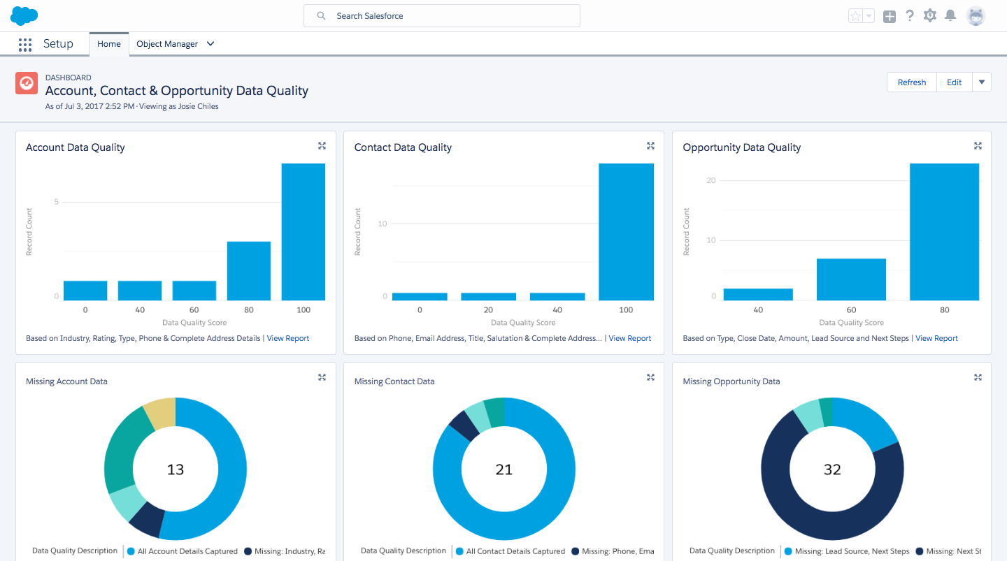
If you google “Salesforce Data Quality” you will get links to the: ( Salesforce Data Quality Analysis Dashboard https://appexchange.salesforce.com/listingDetail?listingId=a0N300000016cshEAA)
This is a good starting point, as it will help you get an overview over records across your system where fields may be empty, and helps you address the Completeness issue.
But there is more to it..
As we have seen, Data Quality is more than Completeness, it is more complex and needs more granularity.
Run a report on your country and or state field, and check out how many records you have for each Country/State value. I’m sure that you are going to be surprised in how many ways the Country/State values can be represented (US, U.S.A, United States, United States of America, United States of the Americas – not to mention other languages: États-Unis (F), Verenigde Staten (NL), Vereinigte Staaten(D), Stati Uniti d’America (IT), Estados Unidos (ES, MX etc.) )
Same probably goes for other business critical fields, as well as checking across fields. Try run a report on your Canadian records, and see how many of these actually have a US postcode, or the other way around. The individual data fields look good, but seen within the context makes the data Invalid, and useless. -and it is not just a North American thing ?, we have been processing international data since 2002, and we can’t tell you how many times we have seen the Scandinavian countries being mixed up, records from Austria and Switzerland being assigned to Germany, France and Belgium etc. etc.
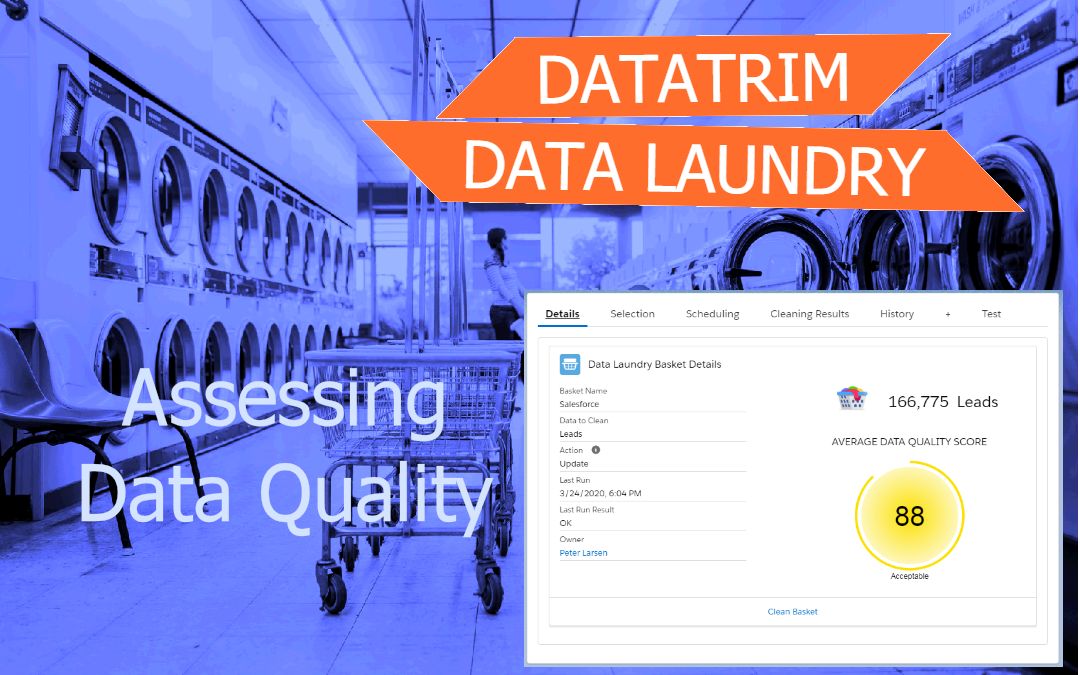
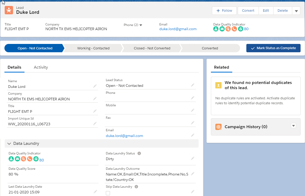
DataTrim Data Laundry Quality Indicators
DataTrim’s Data Quality Indicators is taking you one step further, so on top of checking your fields for completeness, your data is also checked for Validity.
‘Unknown’ , ‘[Not Provided]’, ‘N/A’, ‘unknown@unknown.com’, ‘none@none.com’ – these are example of field-values being populated, thus if you only look at completeness the data quality is good. We therefore talk about 2 levels of Bad Data: Dirty, which means that a record has issues (missing and/or invalid values) and Invalid (no empty fields but has invalid values).
By combining the Completeness with Validity, you get a more nuanced picture of the data quality issues and can better define your strategy and tactics for how to improve the Data Quality and thus improve the likely ness of achieving your business objectives with the data you got.
As for redundancy and duplicate records DataTrim provides 2 other data Quality Apps: DataTrim Dupe Alerts, to identify and eliminate duplicates in existing or new data, and DataTrim Entry Check to prevent the duplicates from being entered in the first place.
Remains to talk about Consistency, which we will save for the next article in this series: Improve Data Quality
The Quality Indicators from DataTrim Data Laundry will both visually as well as textually display the Data Quality issues (if Any) records by record. By including a Textual representation of the Quality Indicator, you can run reports, create List views etc. to select records with particular issues and thereby meassure data quality AND address each issue separately with efficiency.
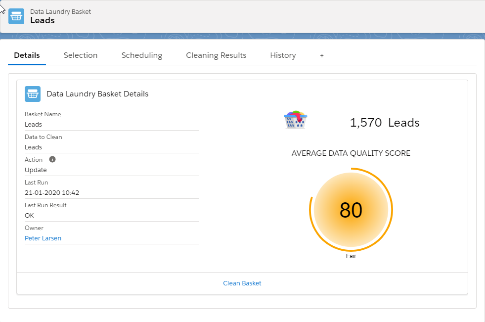
Average Data Quality Score
Just like in the Salesforce Data Quality Analysis Dashboard you may want to create some reports and even some dashboards, based on the DataTrim Quality Score, to be able to meassure the Data Quality by Object or even by segments for e.g. North America, Europe, Asia etc. It may not replace the salesforce reports, but complement them with further details.
In the DataTrim Data Laundry App, we work with Laundry Baskets, which are segments which you can clean or analyze separately. When viewing the Baskets, you will also be able to see the Average Data Quality Score for the data segment, and this way compare the data quality across your database, segment by segment.
Let’s get the numbers right.
The visual Data Quality Indicator and the Data Quality Score included in the DataTrim Package are the basic indicators which might be applicable for 70-80% of all orgs. But if you have something special in your org, and would like to have your own formula, -well be our guest. The indicators in the package is meant as templates, and you can simply copy/paste the formula and modify it to meet your needs.
Conclusion
Quantifying data quality is like ranking good wine onto a scale from 0 to 100, but how many points for the color, the bouquet and the taste? It all depends on who you are and what is most important to you. So, although an out of the box guide book like Robert Parkers Wine Ratings is a good starting point and reference for qualitative scoring of wine, it is after all based on his taste, no? You may not have the same taste preferences, so you might consider customizing the measurements to suit your business data needs.
“Roads were made for journeys, not destinations.” – confucius
Next, let’s get the numbers up.
Now that we have our numbers, we should quickly look into improving them, right?
Check out the next episode in this series: How to Improve Data Quality
At DataTrim…
We provide an out of the box data quality visualization which enables you to make advanced reports, list views and otherwise identify clean and dirty data, so that you effectively can focus on improving the data quality where it matters the most.